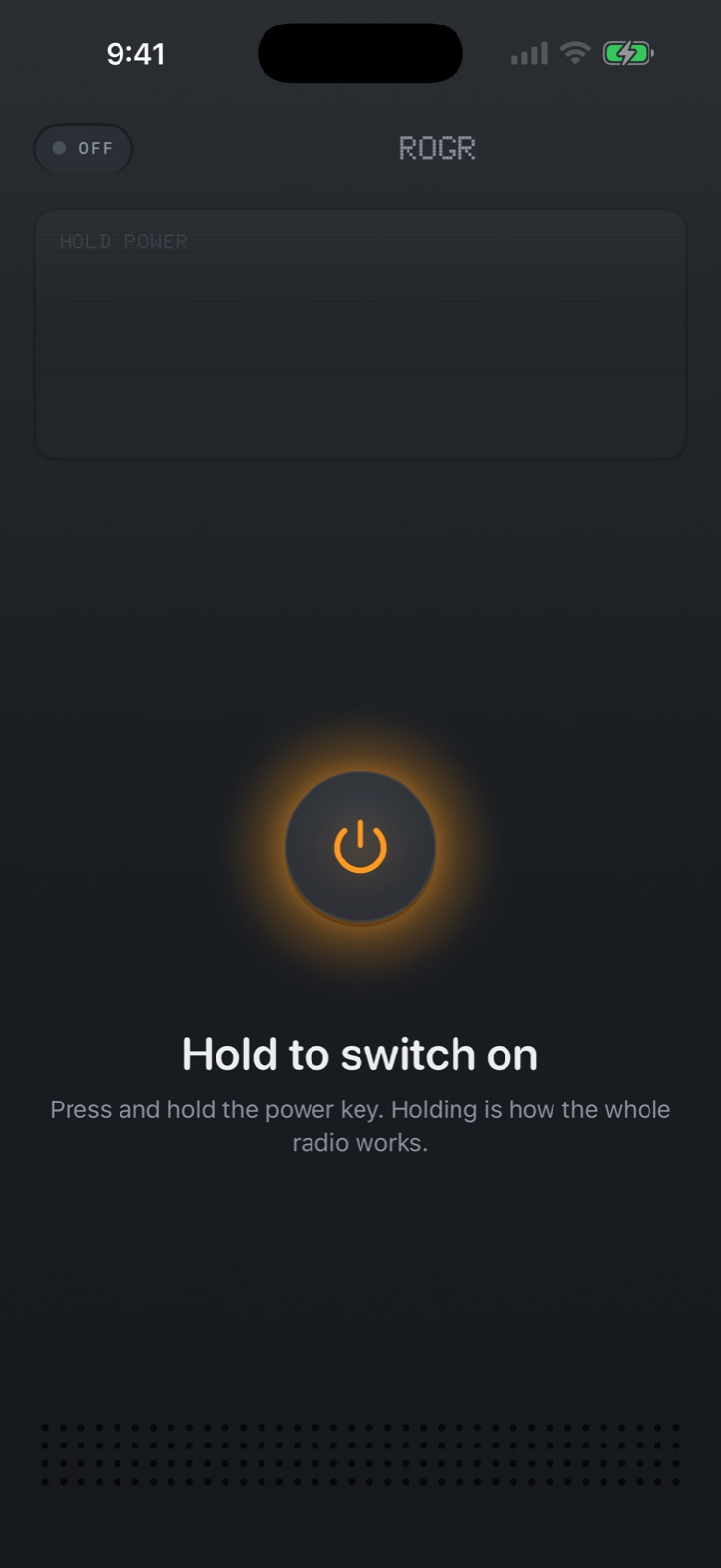
Rogr took two days from a first commit to an App Store submission build. This is the story of how it got made: what we started with, where it got stuck, and how one prompt changed everything about what the app looked like.
Starting from Cribbit
We had already built Cribbit, a baby monitor that connects two iPhones directly over peer-to-peer Wi-Fi with no internet and no account. Cribbit had working transport and media pipelines, encrypted sessions, and a tested UI. The opening prompt for what became Rogr was:
We created an app for baby monitoroingcalled cribbit its in the github folder, i want to use some of the same technologies and allow me to communicate with others like a walkie talkie when there is no internet on both video and audio , can you create a plan and work on this, use applama mcp and other swift ui skill salso to create a plan and start working on this
Three agents worked in parallel, scaffolding the new app from Cribbit's transport, media and UI modules. By the end of the first session the group channel was up: transport, media, the app shell and the UI. The working name was Walk-E.
The foundation held. Cribbit had already proved the peer-to-peer connection. Adapting it for push-to-talk meant adjusting for burst audio rather than continuous streams, and adding floor control so only one person could transmit at a time. The transport changes were the unsexy work that made everything else possible.
Finding people with UWB
While the transport was being tuned, a question came in about direction finding:
is there any chip on the phone to identify where the phones are like how we find airtags with direction
The answer: yes. iPhones with a Ultra Wideband chip — iPhone 11 and later, excluding SE models — can do AirTag-style Precision Finding. A plan followed: point an arrow at a crew member at close range.
The integration hit its own problems. Precise finding froze at 1.3 metres and then jumped to "right here". Logs pointed to the native direction not being used and no smoothing on the readings. A few iterations fixed it: native direction, a smoothing pass, removal of the frozen-reading behaviour.
One more constraint: iOS suspends UWB ranging when the other app moves to the background. The fix was a nudge notification and a locator sound, so a phone that had gone to the home screen could still be reached.
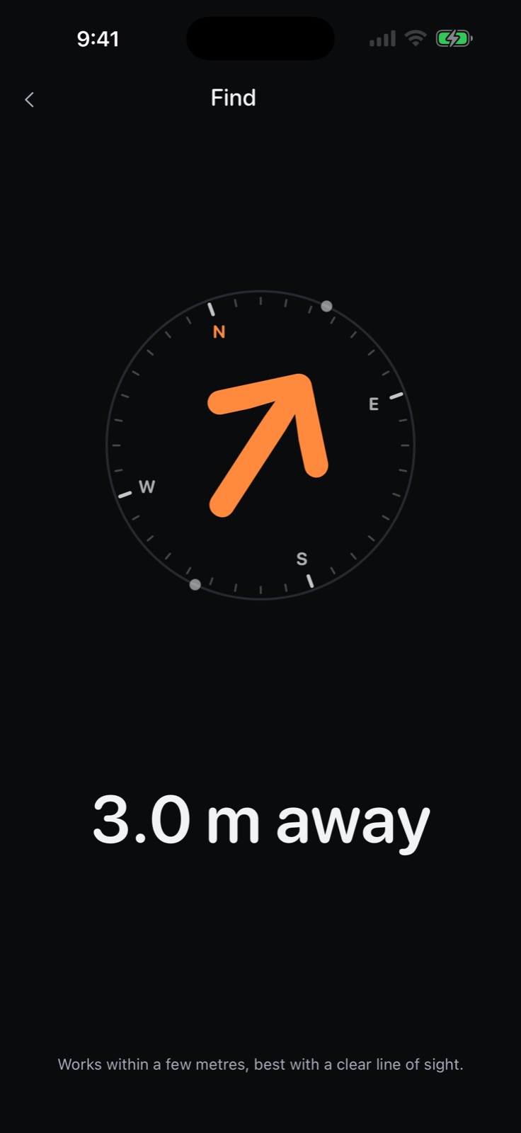 Find, with the UWB compass pointing to a crewmate.
The prompt that redesigned everything
By the end of day one, Walk-E worked. Transport was clean, the group channel was stable, finding was fixed. But the UI was flat — the prompt's own word was "too simple". The prompt that changed the look of the entire app was the longest of the build:
can you create a plan to make the app more fun and realistic to use . Now it's too simple. Add haptic feed back . Make ui more interactive etc . I want this to win apple app of the day. This can be used in festivals, music festivals, trekking etc . Create an Amazing onboarding flow with nice ui and user experience that it's shared among lot of users and becomes the go to application . Think through this fully the buttons the screen the colours the fonts , the navigation . Everything like a real futuristic walkie talkie . Use the image I shared as a reference if required. If there are any skills that you can use feel free to use it .
What came back was a plan, not code: a redesign document describing an aesthetic, an interaction model and an onboarding philosophy. The first phase delivered hold-to-talk as the default, the Doto LCD font for the display, hard keys, the talk bar at the top of the screen, and the speaker grille. The app was also renamed: Walk-E became Rogr.
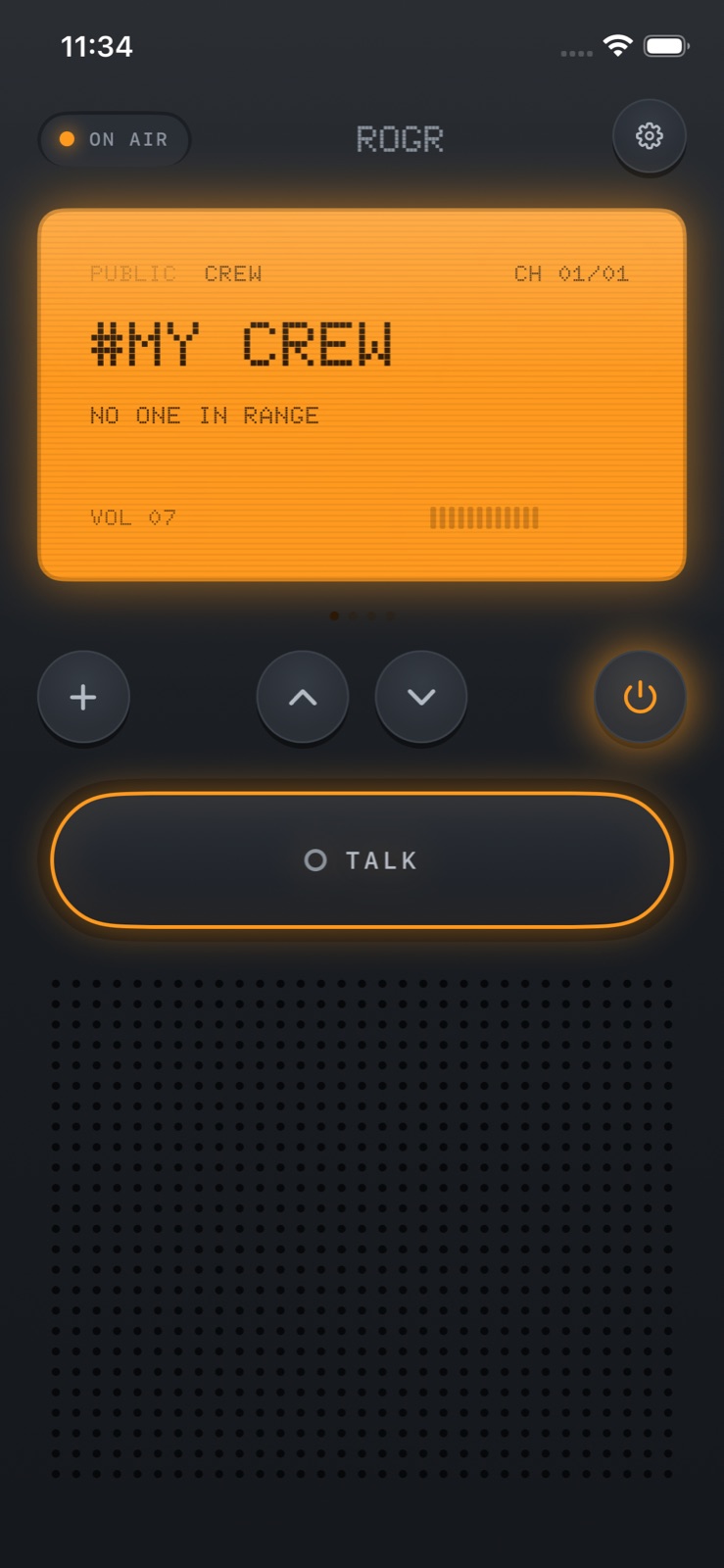 The radio home screen after the redesign: the LCD, hard keys and speaker grille.
The lesson from this prompt was about direction. "I want this to win Apple App of the Day" is not a specification. It's a taste reference and a bar. Responding to it required producing a plan that could be agreed with before any code was written, because the code followed from the plan — not the other way around.
Day two: shaping the feel
The second day was about tactility. A needle VU meter was added — the speaker grille pulses as people talk. The talk bar moved from the top of the screen to the bottom, at this prompt:
I think talk button we can keep in the bottom so it's easier to use with one hand . Also volume increase decrease make it doable from our intuitive walki ui instead of from the settings
This led to a volume knob on the radio face, and a follow-up that added detent haptics — a click for each volume step, a bump at the ends. Crew setup moved into onboarding rather than being a post-launch discovery. The onboarding flow ended with a radio check: hold the button, hear yourself back, confirm the mic and speaker work before going anywhere.
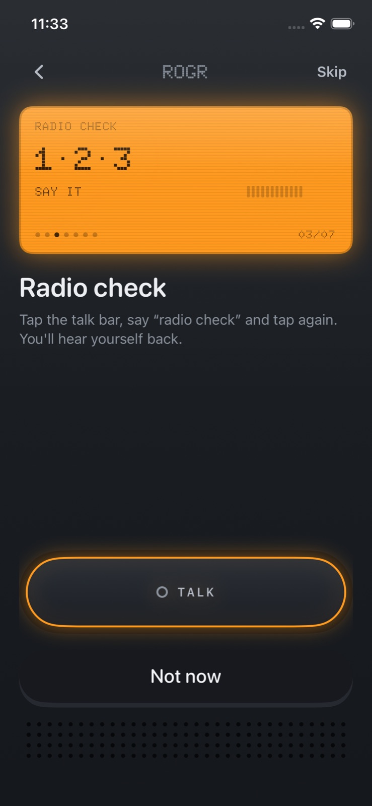 The radio-check step in onboarding: you hear yourself back before you leave.
The Rogr landing page was also built on day two, with an interactive browser radio for people who find the app before they have iPhones in front of them.
What it took
Building Rogr on top of Cribbit was faster than starting from nothing, but not without cost. Cribbit sends continuously; Rogr sends in bursts. Floor control, the VU meter and the radio sound cues were all new work. The UWB integration required debugging against live device logs, not a simulator, because the ranging hardware does not exist in Xcode's simulator.
The build was two days — September 12 to September 13 — from a first commit to a release build with exempt-encryption declared. The shortest sessions were the ones with clear direction. The redesign prompt was long precisely because it needed to convey taste and intent, not just feature requirements.
Rogr is coming soon to the App Store. You can learn more at rogr.xeve.io.