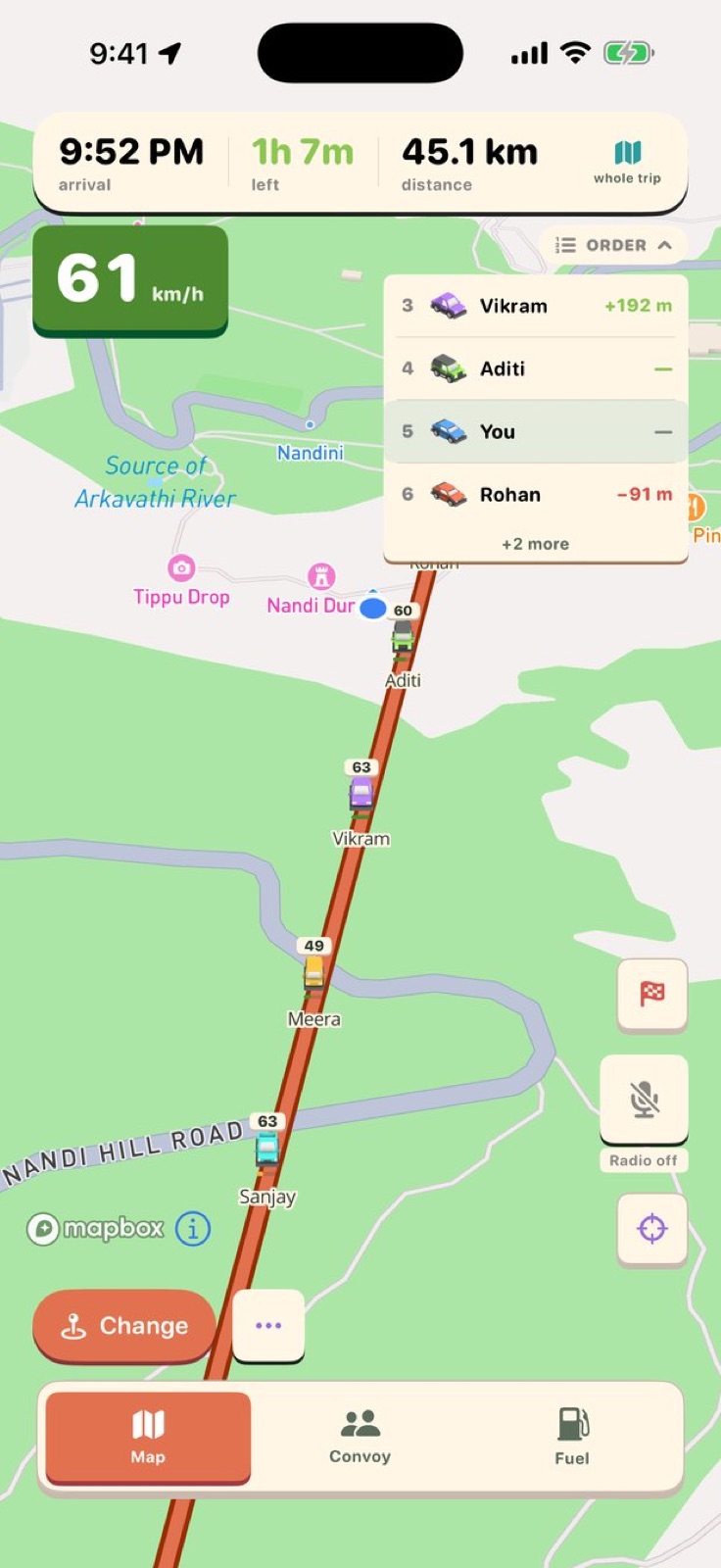
The problem DriveStream solves is easy to describe: group road trips fall apart when one car stops without warning and nobody knows where anyone else is. The solution seems straightforward — put every car on one map. The gap between that description and a CarPlay-integrated convoy app with a hand-authored low-poly map style is where the actual building happened.
This is how DriveStream was built, from the first prompt to the app in beta today.
The first prompt
The starting point was a list of four things:
I want to create an ios app with swift for me and my friends when we go on long drives I want to use this map for navigation and keep all cars in the group in sync, when one of us updates the location others navigation should automatically get updated , 2. see where ach of us are in the map something like bunmp, see what speed we are going on etc , battery life etc 3. Add fuel informatino everytime we reful, cost and how much liters, auto detect petrol bunk and store the details and estimate / show the mileage / km/l of the car with this data 4. walkie talkie feature , either ptt or always on , with carplay feature since its going to be for car primarily .
That prompt produced a plan and a scaffold for the core of the app: shared navigation, live positions, fuel tracking, and CarPlay. The architecture that came out of that first session — the convoy map, the fuel tab, the walkie-talkie and the CarPlay integration — is still the architecture of the app in beta today. All of it was in that first list.
What it produced looked like a working proof of concept, not a product. The map was functional but plain: markers and routes drawn the way any MapKit demo draws them. That was fine. The idea was real; the design was a placeholder.
The pivot to something fun
After fuel tracking, trip recording, and background location were working, the conversation shifted:
i want to now work on imporving the ui, currently its too basic, work on the ui, onboarding. use fun effects , ui , haptic feedback , etc and make the app fun , now its too boridng , also create aproper plan for the workflow , dashboard etc, now everytime i have to create new trip even if i already created a trip , its too basic now , think throughly and work on adding a design system or something so that the app looks super fun to use , you can take more inspeirations if u know any
That session produced a design system, an onboarding flow and a home dashboard. The app felt more polished afterward. But the map was still MapKit with gradients. It looked like a utility.
The low-poly map
The moment that defined DriveStream's look came with a single prompt:
I want to redesign the app ui to be low poly isometric feel good app create a plan , it should be like a game , use pleasant colors etc make it like a game, the whole ui , map , cars inside etc . currently it loosk too plain and simple with gradients, do some research and then create a plan and then work on it
That prompt produced the visual identity the app has today. The map moved from MapKit to Mapbox, with a hand-authored style that makes roads and terrain look like a low-poly game world. Car markers became distinct low-poly vehicles. The palette shifted to something warmer and more deliberate.
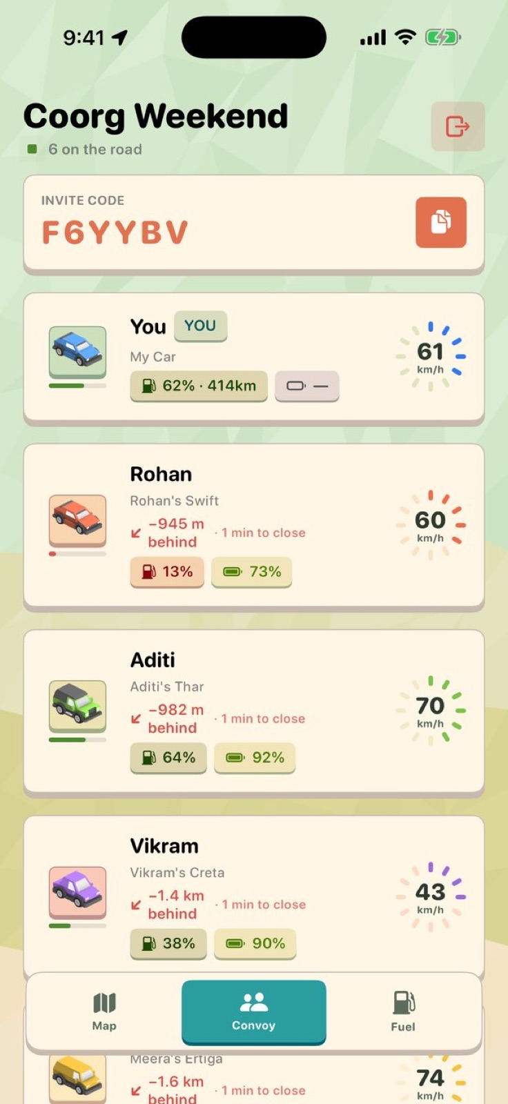 The convoy tab shows each car's gap to the car in front, its speed, fuel level and battery.
"Low-poly isometric, like a game" is an aesthetic direction, not a spec. What came back was a plan, then an implementation, then a Mapbox style file the app loads at runtime. The car rendering, the route styling and the terrain all came out of that one prompt.
The map is now the thing people notice first about DriveStream. The low-poly style makes convoy positions legible at a glance: each car is a distinct object on a simplified landscape, not a dot on a satellite photo.
Speed readouts and small details
After the visual redesign came sessions of refinement. One stands out for being short and having an immediate effect:
Can we add speeds on top of the cars like how bump shows ? With animations .
That produced live speed readouts above each car, with a small animation as the number updates. On screen, it is one of the most useful things the map does: you can see at a glance not just where each car is but how fast it is moving, and whether anyone is slowing down.
Another session asked for "neon glow like wheezl" and came back with a glowing route line instead of glowing cars, which turned out to look better. A later session noticed that maps conventionally show the car heading upward, and that became a heading-up mode while driving.
These sessions follow the same pattern: a specific observation from using the app, a prompt that names what was wanted, an implementation that sometimes interprets the request better than the request described it.
What the app does now
DriveStream records every drive at 1 Hz, storing the route, distance, moving time and top speed. The replay runs animated on the map at up to 300x speed.
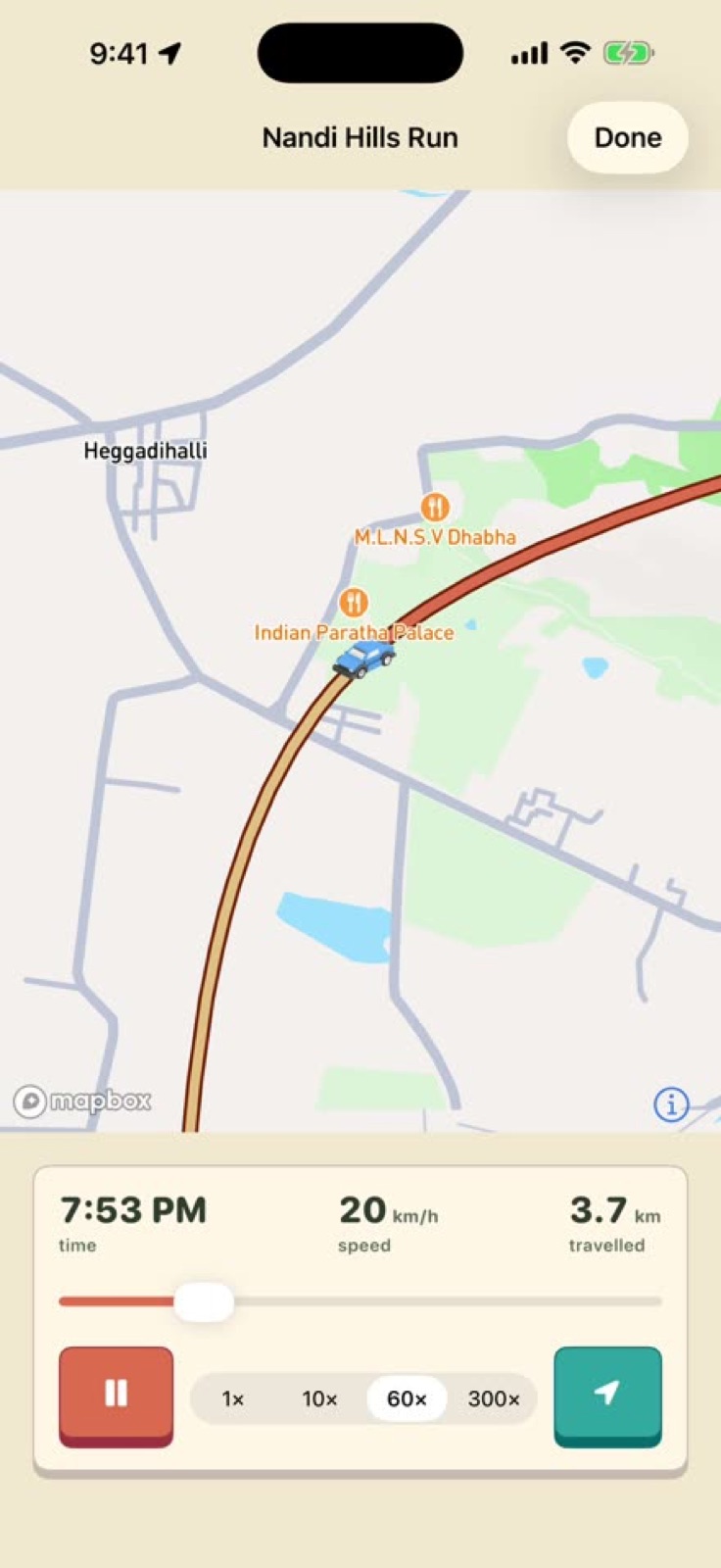 Every drive is recorded. The replay runs at up to 300x speed with a scrubber.
A rank system runs from Rookie through seven tiers to Legend at 40,075 km — the Earth's circumference. The walkie-talkie carries live audio without stopping music, and a shared destination reaches every phone in the convoy with traffic-aware ETAs and turn-by-turn guidance.
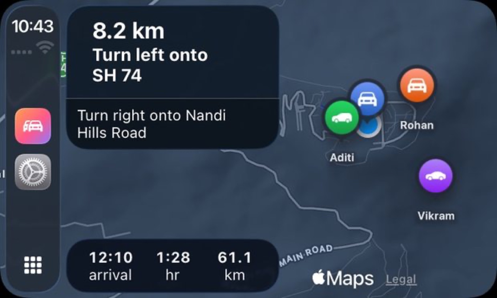 CarPlay shows the convoy map alongside turn-by-turn guidance.
The app is in beta for iOS 26 at drivestream.app.
Looking back at the build notes, the thing that stands out is how much of the finished app was already in the first prompt. The convoy map, fuel tracking, the walkie-talkie and CarPlay were all in that first list of four things. The work that followed was refinement, polish and the discovery that "like a game" was a precise instruction about how a map should look.